read_ref_file="sacB_ref.fasta"
ref=next(SeqIO.parse(os.path.join(data_path,read_ref_file),"fasta"))
ref_seq=str(ref.seq)
gen_list=parse_genotypes(os.path.join(data_path,"sacB_genotypes.csv"))plotting
Functions to visualize mutation data from DGRec experiments. Provides nucleotide-level and protein-level mutation plots, including position-specific mutation counts, frequencies, and amino acid heatmaps.
Example data
Load example genotype data for demonstration.
Nucleotide-level mutation plots
Functions to visualize mutation counts and frequencies at each nucleotide position.
plot_mutations
def plot_mutations(
    gen_list:list, # list of genotypes. Each genotype is a tuple: (string representation of the genotype, number of molecules)
    ref_seq:str, # reference sequence
    sample_name:str=None, # sample name
    plot_range:Union=None, # limits the plot to the specified range
    TR_range:Union=None, # when specified creates a shaded box highlighting the position of the TR
    ax:NoneType=None, # makes it possible to pass matplotlib axis to easily configure and save plots
    savefig:str=None, # path to save the figure (e.g. 'output.png')
    dpi:int=300, # resolution for saved figure
):
Plots a stacked bar chart of mutation counts at each position.
Mutations outside the plot_range are excluded from the visualization.
ax = plot_mutations(gen_list, ref_seq, sample_name="sacB", plot_range=[0,139], TR_range=[50,119])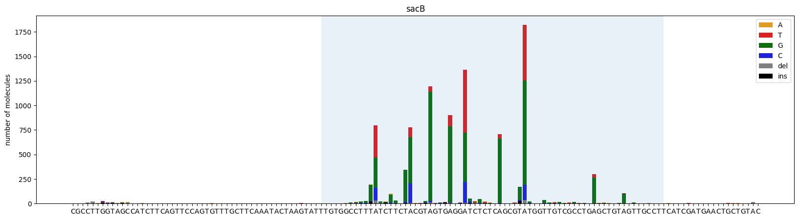
plot_mutations_percentage
def plot_mutations_percentage(
    gen_list:list, # list of genotypes. Each genotype is a tuple: (string representation of the genotype, number of molecules)
    ref_seq:str, # reference sequence
    sample_name:str=None, # sample name
    plot_range:Union=None, # limits the plot to the specified range
    TR_range:Union=None, # when specified creates a shaded box highlighting the position of the TR
    rev_comp:bool=False,
    ax:NoneType=None, # makes it possible to pass matplotlib axis to easily configure and save plots
    savefig:str=None, # path to save the figure (e.g. 'output.png')
    dpi:int=300, # resolution for saved figure
):
Plots mutation frequencies as percentages at each position.
Supports reverse complement conversion. Mutations outside the plot_range are excluded. Returns the axes and the total percentage of mutagenized molecules.
ax,mut_perc=plot_mutations_percentage(gen_list, ref_seq, sample_name="sacB", plot_range=[0,139], TR_range=[50,119])
plt.show
print(mut_perc)
9.73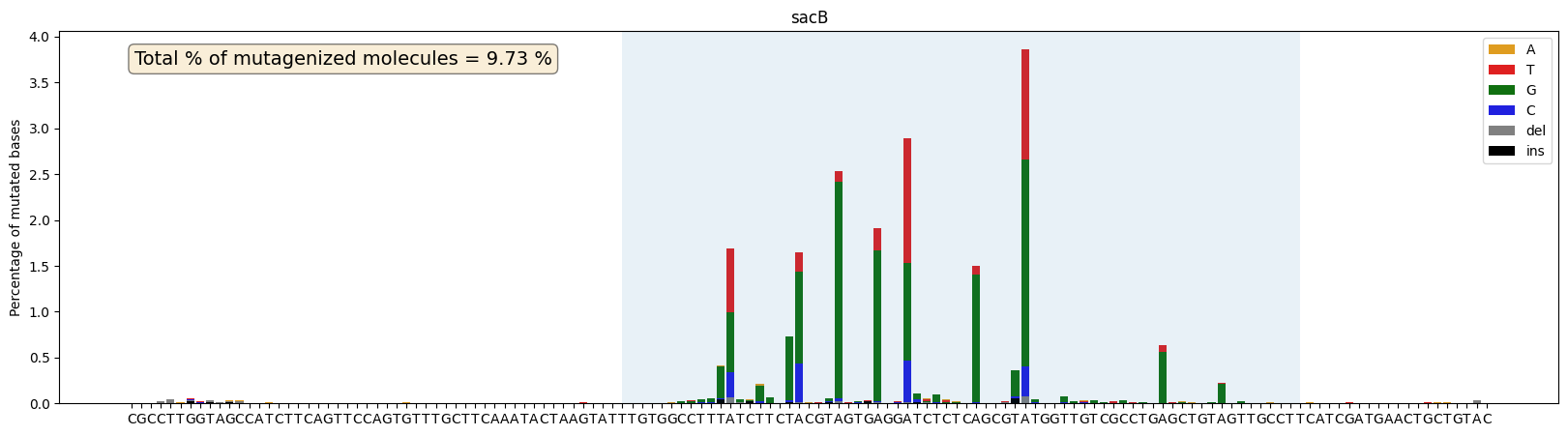
ax = plot_mutations_percentage(gen_list, ref_seq, sample_name="sacB", plot_range=[0,139], TR_range=[20,89],rev_comp=True)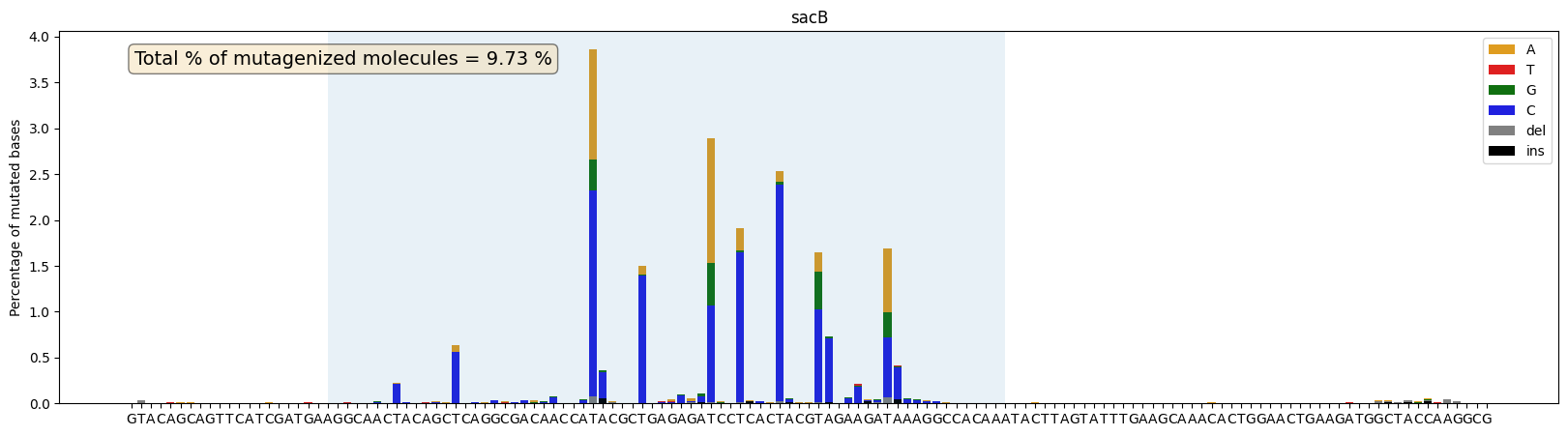
Protein-level mutation plots
Functions to visualize amino acid mutation frequencies.
plot_mutations_percentage_protein
def plot_mutations_percentage_protein(
    aa_mut_list, # list of genotypes. Each genotype is a tuple: (string representation of the genotype, number of molecules)
    ref_prot, # reference sequence
    plot_range:NoneType=None, # limits the plot to the specified range
    ax:NoneType=None, # makes it possible to pass matplotlib axis to easily configure and save plots
    savefig:str=None, # path to save the figure (e.g. 'output.png')
    dpi:int=300, # resolution for saved figure
):
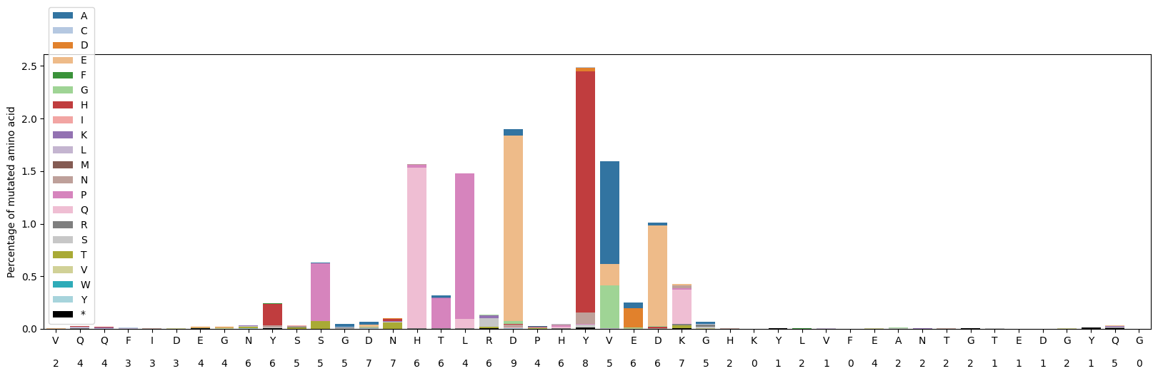
Plots amino acid mutation frequencies at each protein position.
Shows stacked bars of mutation percentages with the count of unique amino acids observed at each position displayed below the reference residue.
aa_mut_list=get_aa_mut_list(gen_list,ref_seq,ori=-1) #the sacB gene is in reverse complement orientation compared to the VR so ori=-1 is needed
aa_mut_list[:10]
[('', 43341),
('Y22H', 351),
('H15Q', 277),
('D19E', 246),
('L17P', 200),
('V23A', 162),
('S11P', 117),
('D25E', 113),
('D19E,Y22H', 75),
('T16P', 61)]ref_prot=Seq(ref_seq).reverse_complement()[:-1].translate() #the sacB gene is in reverse complement orientation compared to the VR
fig, ax = plt.subplots(1, 1, figsize=(20, 5))
plot_mutations_percentage_protein(aa_mut_list, ref_prot, ax=ax)
plt.show()